On pie charts—the human eye isn’t good at computing the areas, making them of limited utilities: @mattcampux @refreshdc #dataviz
Data visualization pioneer Hans Rosling passed away this morning.
bit.ly/2kDBR26 #ddj #dataviz
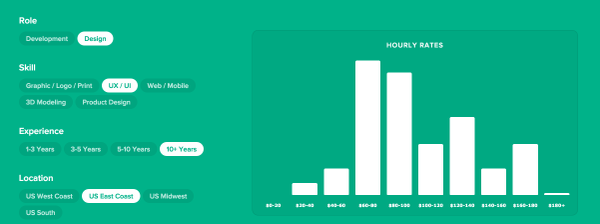
Interactive chart of freelance rates for designers/developers: hellobonsai.com/rates #ux #ui #ia #mobile #dataviz

Nice presentation of @awoodruff about #maps and #dataviz in #openvisconf
axismaps.github.io/blindfolded-c…

Looking for a job, #wcphilly? @pewresearch is hiring! Bonus if you have #dataviz chops. pewresearch.org/about/careers/we… talk to me or @kingkool68
Love #dataviz? Work with me at @pewresearch – we have an opening for an information graphics designer! pewrsr.ch/1nC7LcU
“When you learn to code, you’re learning to think precisely, logically, and analytically” hilarymason.com/blog/learn-to-co… by @hmason #ddj #dataviz
Trick or Treaters 2012 Visualized pi.pe/-uwmv0x #dataviz
#interactive shows world muslim population growth rate + projections through 2030 bit.ly/fyiRne @pewresearch @pewforum #dataviz
@aaronjorbin The Google Visualization API is neat code.google.com/apis/visualizati… #dataviz
