@anthonydpaul @jcasabona I hate when people say “former” and “latter”
I’ve been thinking about the design of comments on a website. What are some well designed comments you’ve seen?
@round I used to have a movie promo cup. It was a pretty good cup.

Styled the links in the sidebar and added a proper working search input. Also tweaked some of the layout.
Trying to keep posting my progress as I go. Is that what @dribbble is for?

@elgreg Awwww ✌️
@bradtaunt Saw your article on Hacker News. I dig your articles and thought you’re worthy of a follow 🌟
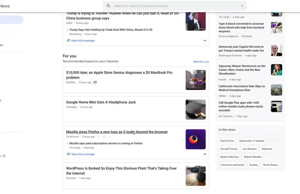
Disabled JavaScript and then I could read the page again… techcrunch.com/2019/06/11/mozill…
I love when the complete article flashes before your eyes before the page gets borked. Yay JavaScript!

@neoperitus Too late.
@brandonsavage I dig CircleCI
* due to :last-child()
In the amount of time it takes you to read through the documentation you can learn how to do this with standard, no-frills, HTML and CSS that works since 2009* almonk.github.io/pylon/#lists
@andybelldesign Came in handy for doing this twitter.com/kingkool68/status/11…
@tessak22 @getpantheon @CircleCI @circleCI is awesome
@andybelldesign /slug/
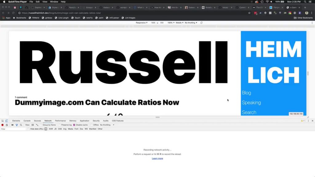
I’ve been working on my personal site for a little bit and came up with this header that uses viewport width (vw) units
Pros:
– Scales uniformly as the viewport shrinks
Cons:
– vw units aren’t affected when you scale the text up or down. They stay the same size 🙁

@mgrdcm Dummyimage.com was the first PHP I ever wrote. How about that!
@mgrdcm That’s awesome that yours is still up. Most of these… not so much russellheimlich.com/blog/list-of…
